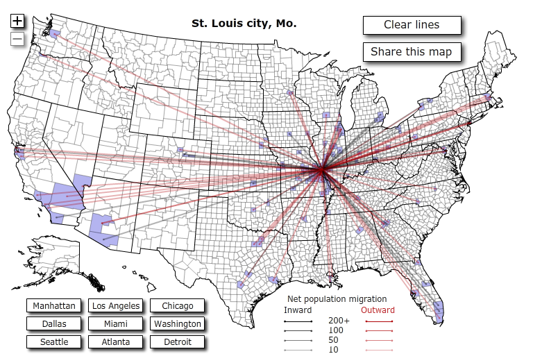
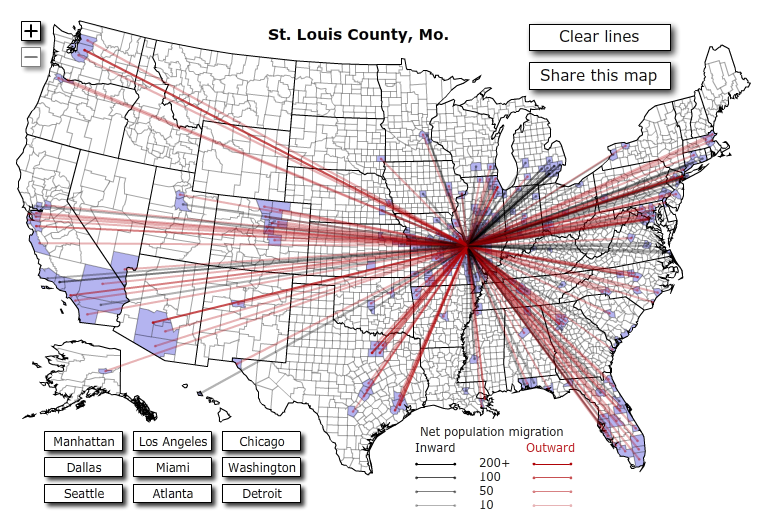
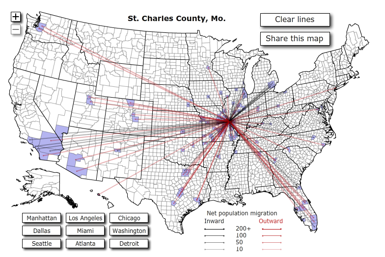
Thanks to Lani Rosales with Agent Genius, I found a tool offered by Forbes that lets you evaluate if there are more people moving in or out of an area. Even better, the interactive map even shows you exactly which counties are seeing population movement exchanges.
I checked the map to compare the trends for the 3 major counties that make up the St. Louis area.
The red lines mean people were moving away from St. Louis. The black lines mean they were moving to St. Louis.


NOTE: The data is based on 2008 census figures, and they only reported population exchanges with 10 or more people moving between the same counties.
Did you notice that St. Charles County seems to be having more inbound relocating people compared to the other two counties?
Actually, I’m not surprised. I spent the first 5 years of my real estate career working almost exclusively with relocating buyers. A large percentage of them wanted newer construction, bigger homes and decent schools. Though they said they wanted big yards and privacy off their back patio, most were willing to sacrifice these two items when the only way they could get the yard they wanted was to buy a 1970s house or spend a lot more money.
Of course, there were always some people who wanted historic homes or a 10 minute commute to their St. Louis City or County job. But there simply weren’t as many of these people as there were of the families opting for the outer-ring suburbs.
For more detailed information, click through to the Forbes site and hover over each of the counties to see how many people moved, their average income and the metro area.


